Hey there guys and girls,
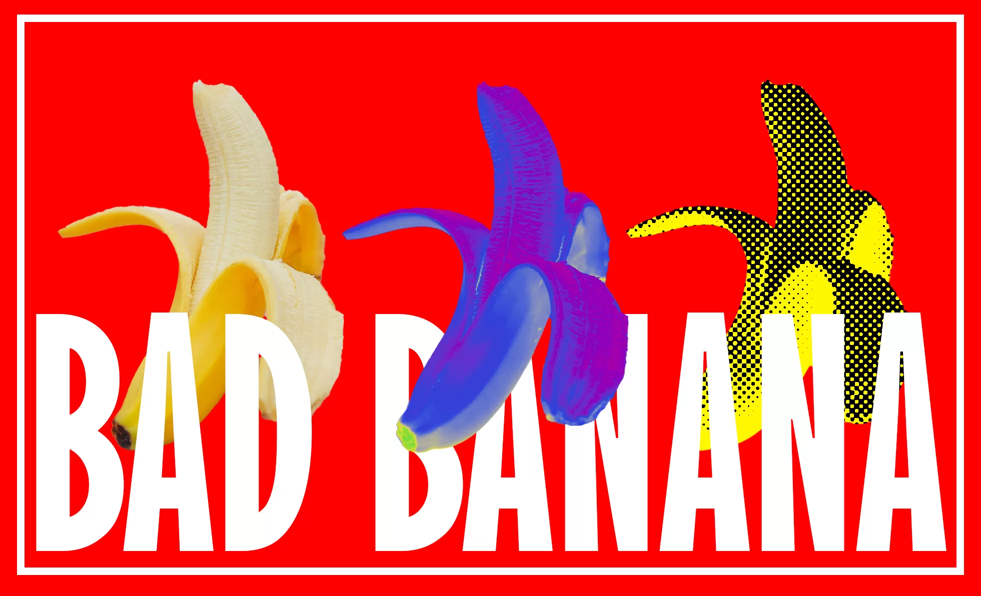
Today i want to show you how to create a banana design like the on above, or at least show you my process behind it. And as with everything i come up with this one is completely random, i decided to work in photoshop this time and not in illustrator because this piece wont be for screenprints but rather DTF (Direct To Film) which can get more colors onto the fabric.
The Idea
At first i was thinking about making a floral design, but there are so many generic ones out there and for me to come up with something rather fast seemed difficult, so i went the nature route and there was a picture on pinterest, which was just a pixaleted banana but it somehow struck me as worthy of being tried out. so i hopped onto unsplash (a great website to find royalty free images) and grabbed a banana off there.
Color scheme and placement
To be fair the whole design thing just came to me like,…..mhm i like it pretty bold and full of colors also i kinda want to use filters…. so i applied a gradient map to the nana and went from there. the red background just stuck with me from the gradient map so no worries it just plopped up and i kept it. Typography wise i first tried a smaller font that filled the whole rectangle but i disliked it a lot since it completely threw off the balance of the design being to hard to grasp the picture. then i settled on the font you see above and cranked up the size a lot, basically until it fit the rectangle. now it was looking super supreme-esque with the white font on top of the red but pffff idc. Then the image was still missing something, up until this point it looked a littel set off because there was just one banana in the middle with a weird gradient on top 🙂 so i slapped two more on there, but just the regular one. i also tried flipping them around but it just wasn’t hitting the vibe of the design.
Getting the composition right
The big problem i see with all kinds of designs is weigth and depth, like for me weight plays a huge role to keep the designs balanced to the eye, and to be frank most of the time its just moving stuff around or changing colors. as for depth i tried the classic go-behind-and-in-front-of-the-text thing. it really works wonders 😉 you can also try to offset the assets a little, like the bana in the middle which is a little offset downwards. and from there i decided the third banana needed a filter ontop and what better way than halftone babyyyy! and thats mostly it. done.
Conclusion
So concluding everything here i quite like what came out of my head this time. I still would really like for you guys to rate that thing because its important to get feedback. apart from that i hope you guys have a great day.
See you soon!
Sandro.
